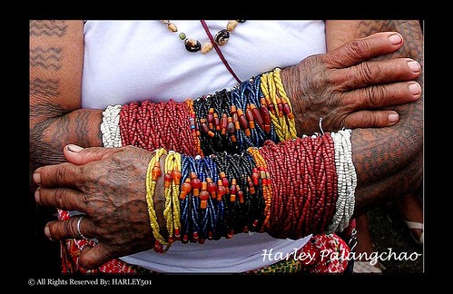
Editors Comment: It's a very interesting subject. The first thing that catches your eyes are the colorful bracelets (or whatever they're called). Then your eyes wander to the rest of the photo noticing the texture of the skin and the patterns of the tattoo. This photo is oozing with character and interesting elements.
Editors Comment: This portrait shot is just perfect. You can see in this photo the glow of the childs face because of the brilliant use of light. The skin tone is just superb. Wonderful piece of work.
Editors Comment: This one is an eye-catching picture for me. I like the silhouette of the kid. Aside from the interesting lighting which added drama , it definitely inspires more people to engage themselves into photography even the young ones.
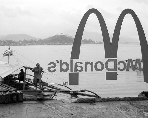
"I got it...2 big Macs, 1 quarter pounder..."
by: "Darren Abecede" a.k.a "Darren A."
Canon PowerShot SD550; 0.005 sec (1/200); f/10 @ 15.6 mm
by: "Darren Abecede" a.k.a "Darren A."
Canon PowerShot SD550; 0.005 sec (1/200); f/10 @ 15.6 mm
Editor's Comment: Simple and astounding! It's inspiring in a way that it's nice to know you SHOULD take your camera anywhere you go because you just might be inspired by what you see along the way... or in the case of this photo, while you are eating. How many times have you seen great images around you, your trigger itches, so to speak, but then the feel of a the shutter just isn't there? Then, realizing that you left it at home, in the trunk of the car or in the office, you want to weep and knock your self unconscious so you wouldn't see what next spectacular image will flee from you eyes.
This one perfectly fits the category I'm filling for this week. I really have to take a bow for this one by Darren A. Although, it seems to want more of the subjects at the left and right of frame, the idea arrives solid--both funny and sensible. The black and white rendering helps to rivet your attention to these prime elements, ignoring the background, which in color, might also be spectacular. Take the two prime elements (the McDonald's sign and the fishermen) separately and they don't appeal much at all, but put them in one photo like this, add a witty title, and you got a PoW! :D
This one perfectly fits the category I'm filling for this week. I really have to take a bow for this one by Darren A. Although, it seems to want more of the subjects at the left and right of frame, the idea arrives solid--both funny and sensible. The black and white rendering helps to rivet your attention to these prime elements, ignoring the background, which in color, might also be spectacular. Take the two prime elements (the McDonald's sign and the fishermen) separately and they don't appeal much at all, but put them in one photo like this, add a witty title, and you got a PoW! :D


No comments:
Post a Comment