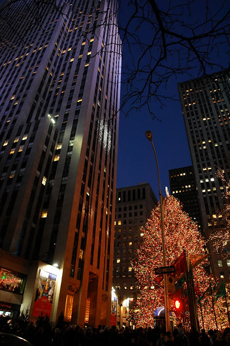
Walking up the New York city streets.
In the biting afternoon of a cold winter.
Wishing to see sunny Pugong sheets
Greet me. Or a warm beach of summer
Where I'll find the smiles, like sweets;
Festival or just a plain walk of leisure.
In the biting afternoon of a cold winter.
Wishing to see sunny Pugong sheets
Greet me. Or a warm beach of summer
Where I'll find the smiles, like sweets;
Festival or just a plain walk of leisure.
Here are this weeks FPC's PoW!s, in no order of preference:
Editors Comment: Summer is just around the corner and this photo is the reason why we should really look forward for it.
Photographer's Description: ~Every sunset brings the promise of a new dawn~
Boracay...Philippines!
Editor's Comment: The silhouette and the whole photo has a very calming effect on ones eyes. It makes me want to have a long vacation and enjoy the view as long as I can.
Photographer's Description: My pictures have been few and far between lately. Work and personal priorities have overtaken me. I am preparing for a longer trip to Indonesia in a few days so even attending the grand mardi gras parade of the much awaited Sinulog last weekend was in doubt. I was glad that excitement overtook my indolence. Being at the street party was a welcome workout for my lonely camera.
propsmen of the Inayawan contingent, at the Sinulog mardi gras, Cebu City, the Philippines
Editor's Comment: Of the sinulog photos I've seen this year, this one stands out. No it's not more colorful than the others and the smiles of the subjects are not the warmest but the basics of composition are well observed in this photo.
There's rhythm in patterns, elements and color. Also the contrasting yellows and reds add impact. All these qualities compliment the main subject and focal point of this photo, the boy in the middle.
Bravo!!
Bravo!!
Editor's Comment: No spectacular fireworks, no full moon, no streaks of vehicular lights. Yet this photo captivates my attention as I was going back and forth the pages to finalize my pick for this week. And each time I come back, there is more to say to this photo than the others. First, the choice of elements--a lit tree instead of fireworks, a lamp post light instead of the moon and the parallel lines of the big building in lieu of vehicular lights. And looking closely at the lower part, you see people, which adds to the perspective and to the mystery.
Second is the composition. There is no center subject so you are forced to look around the frame, which will guide you to the well-picked elements. The branches of tree at the top breaks the monotony at the top making it equally interesting with the bottom. Third is the gamut of colors blending at the middle. Nicely done, Lenny!
Second is the composition. There is no center subject so you are forced to look around the frame, which will guide you to the well-picked elements. The branches of tree at the top breaks the monotony at the top making it equally interesting with the bottom. Third is the gamut of colors blending at the middle. Nicely done, Lenny!


No comments:
Post a Comment